
Social proof on mobile: the 6 patterns, the 3 failure modes, and the 5-item checklist
Social proof on mobile has 6 patterns: the mobile-first card, the vertical stack, the mobile-optimized star rating, the mobile video testimonial, the mobile trust badge row, and the mobile review snippet.
The patterns differ from desktop because mobile is thumb-driven, data-constrained, screen-constrained, and fast-exit. The right pattern depends on the page, the product, and the visitor’s intent. The wrong pattern is the desktop pattern copied to mobile without changes.
This page is the mobile view. The displaying testimonials page is the broader display category. The wall of love page is the wall pattern. The testimonial page design page is the design view. The testimonial carousel page is the carousel pattern. This page is the mobile-specific patterns: the 6 mobile patterns, the 3 failure modes, the 5-item checklist, and the 3 things to test.
What mobile social proof is, and what it isn’t
Mobile social proof is the set of patterns, layouts, and content choices that make social proof work on mobile devices. The devices are smaller, the networks are slower, the interactions are touch-based, and the attention spans are shorter. The patterns must adapt to all four.
Mobile social proof is not a scaled-down desktop wall. The desktop wall relies on hover states, multi-column layouts, and inline video. Mobile cannot rely on any of these. The patterns must be rebuilt for the mobile context, not just resized.
Mobile social proof is also not just “make it responsive.” Responsive design is the technical floor: the layout adapts to the screen. Mobile-first design is the strategic move: the layout is built for mobile, then enhanced for desktop.
The 3 reasons desktop patterns break on mobile
The first reason is the tap target. Desktop relies on clicks with precise cursors. Mobile relies on taps with thumbs. The recommended tap target is 44×44 pixels. The desktop testimonial card with a small author link is un-tappable on mobile. The visitor cannot complete the action.
The second reason is the layout. Desktop uses multi-column layouts (3-4 testimonials across). Mobile uses single-column (1 testimonial at a time). The desktop layout on mobile makes text unreadable and images too small. The mobile layout needs to be rebuilt, not just shrunk.
The third reason is the loading time. Desktop uses large hero images and inline video. Mobile uses compressed images and lazy-loaded video. The desktop assets on mobile consume too much data and load too slowly. The visitor leaves before the proof loads.
The 6 mobile patterns
The first pattern is the mobile-first testimonial card. The card is full-width, single-column, with large text (16px minimum), a clear author block (photo + name + role), and a visible star rating. The card is the unit of mobile social proof. The card works for every page type.
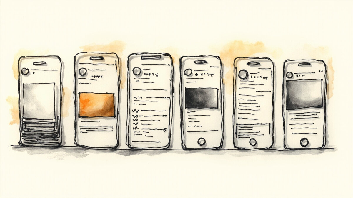
The second pattern is the vertical testimonial stack. The stack is a vertical scroll of 3-5 testimonial cards. The stack is best for pages with depth (product page, SaaS homepage). The visitor scrolls through the proof. The stack replaces the desktop grid.
The third pattern is the mobile-optimized star rating. The rating is a large star icon (44px tall) plus a numeric score (e.g., “4.8/5”). The rating is placed near the buy button or the title. The rating is the trust anchor for the visitor who skims. The rating works for every page type.
The fourth pattern is the mobile video testimonial. The video is vertical (9:16 aspect), 15-30 seconds, no autoplay. The video plays on tap. The video is best for product pages and category pages. The video is the highest-impact pattern but also the most data-intensive. The video is for visitors who want depth.
The fifth pattern is the mobile trust badge row. The badges are horizontal-scroll, large icons (44px tall), 3-5 badges visible. The badges sit in the footer or near the buy button. The badges are best for checkout and product pages. The badges are the floor for trust.
The sixth pattern is the mobile review snippet. The snippet is a 1-2 sentence quote with a “read more” link that expands to the full review. The snippet is best for category pages and search results pages. The snippet is the lowest-friction pattern. The snippet works for every page type.
For the carousel pattern that works well with mobile swipe gestures, see the testimonial carousel.
The 3 mobile-specific failure modes
The first failure mode is the slow load. The mobile testimonial section has 5 high-resolution photos and a background video. The section takes 8 seconds to load. The visitor leaves before the proof appears. The fix is to compress photos, lazy-load videos, and prioritize the first testimonial card.
The second failure mode is the small tap target. The testimonial card has a small author link (24px). The visitor cannot tap the link with a thumb. The fix is to make the entire card tappable (44px min) and the link optional.
The third failure mode is the autoplay video. The testimonial video autoplays on page load. The visitor did not ask for the video. The video consumes data and battery. The fix is to require tap-to-play. The video is opt-in, not opt-out.
For the slider pattern that needs mobile-specific adjustments, see the testimonial slider.
The 5 mobile optimization checklist items
First: the images are compressed. The testimonial photos are under 100KB each. The photos load in under 1 second on a 4G connection. The compression is the speed floor.
Second: the tap targets are 44px minimum. The author link, the star rating, the “read more” link are all 44px or larger. The targets are thumb-friendly.
Third: the layout is single-column. The testimonial stack is one card wide. The visitor does not have to zoom to read. The layout is screen-native.
Fourth: the video requires tap-to-play. The video does not autoplay. The video loads on tap. The visitor chooses to consume the data.
Fifth: the proof is above the fold or close to it. The first testimonial or the aggregate rating is visible without scrolling. The visitor sees the proof in the first 3 seconds.
For the trust badges that complement mobile testimonials, see the trust badges.
The 3 things to test on mobile
The first thing to test is the pattern. The team runs an A/B test with two patterns (e.g., card stack vs review snippet). The team measures the conversion rate. The team picks the winner. The test takes 2-4 weeks to reach significance.
The second thing to test is the placement. The team runs an A/B test with two placements (e.g., above-the-fold vs below-the-fold). The team measures the conversion rate. The team picks the winner. The test takes 2-4 weeks.
The third thing to test is the content. The team runs an A/B test with two content versions (e.g., 3 short quotes vs 1 long quote). The team measures the conversion rate. The team picks the winner. The test takes 2-4 weeks.
The journey after this page
If you have the mobile view and want the broader display category, the displaying testimonials page is the parent reference. For the wall pattern, the wall of love page is the dedicated reference. For the design view, the testimonial page design page is the dedicated reference.
For the carousel pattern (which works on mobile with swipe gestures), the testimonial carousel page is the dedicated reference. For the slider pattern, the testimonial slider page is the dedicated reference. For the CTA at the bottom of the mobile section, the testimonial CTA page is the dedicated reference.
For the trust badges that complement the testimonials on mobile, the trust badges page is the dedicated reference. For the product page-specific mobile patterns (a specific use case), the testimonials on product pages page is the dedicated reference.
For the software that supports mobile-optimized walls out of the box, Testivo is one tool with mobile-first wall templates. The mobile patterns are the constraint. The tool is the delivery.
The 6 patterns work together. A product page can have a star rating near the buy button (pattern 3), a vertical stack of review cards below the description (pattern 2), and a mobile trust badge row in the footer (pattern 5).
The combination covers the visitor who skims (rating), the visitor who scrolls (stack), and the visitor who wants the trust floor (badges). The right combination is not all 6 on every page. The right combination is 2-3 patterns per page, matched to the page intent.
The 6 patterns are also device-aware. The mobile-first card (pattern 1) is the same as the desktop card. The vertical stack (pattern 2) replaces the desktop grid. The mobile-optimized star rating (pattern 3) is the same widget, larger size.
The mobile video (pattern 4) is vertical, not horizontal. The mobile trust badge row (pattern 5) scrolls horizontally. The mobile review snippet (pattern 6) is the desktop snippet with smaller text. The patterns adapt the desktop patterns. They do not invent new ones.
The mobile-first card is the workhorse. It appears on most product pages, most homepages, and most landing pages. The card is the one pattern that never fails on mobile. If a team only has time to implement one pattern, this is the one.
Everything else builds on top of the card.
The 4 mobile-specific patterns that convert better
Mobile visitors behave differently from desktop visitors. The 4 mobile-specific patterns below convert better than desktop patterns applied to mobile.
Pattern 1: Vertical scrolling testimonial cards. Mobile users scroll vertically. Cards designed for vertical scrolling work better than horizontal sliders. The card is full-width on mobile.
Pattern 2: Tap-to-expand testimonials. Short testimonials are visible. Long testimonials expand on tap. Mobile visitors prefer tap interactions over scrolling for content depth.
Pattern 3: Bottom-sheet style submission forms. Forms that slide up from the bottom feel native on mobile. The interaction matches mobile conventions. The submission conversion is higher than full-page forms.
Pattern 4: Sticky social proof bar. A persistent strip of testimonials at the bottom of the screen. The strip follows the visitor as they scroll. The visibility is constant without taking screen space.
The 4 patterns are mobile-native. They outperform desktop patterns adapted to mobile. Most businesses under-invest in mobile-specific design.
How mobile social proof affects app installs and signups
For mobile-first products, social proof affects install and signup decisions differently. The 4 patterns below describe the impact.
Pattern 1: App store social proof. The app store rating and review count is the strongest social proof on mobile. A 4.6-star app with 10K+ reviews installs at 3-5x the rate of a 3.8-star app.
Pattern 2: In-app first impression. The first time a user opens the app, social proof matters less than the experience. The testimonials come later in the journey.
Pattern 3: Mobile web signups. Mobile web visitors convert at 1-3% typically. Adding social proof lifts conversion to 2-5%. The lift is smaller than desktop but still significant.
Pattern 4: Cross-platform consistency. The social proof on mobile should match the desktop experience. Visitors who switch devices see consistent proof. The brand feels reliable.
The 4 patterns show that mobile social proof is structurally different from desktop. Treating mobile as a smaller version of desktop misses the patterns.