
Testimonial CTA: the 5 patterns, the 3 design rules, and the 4 placements
A testimonial CTA is the call-to-action button placed at the bottom of a testimonial section. The 5 patterns are trial, demo, consultation, download, and soft.
The right pattern depends on the page type (homepage, pricing, landing) and the funnel stage (cold visitor, warm lead). The wrong CTA is “Click here.” The right CTA is specific, outcome-oriented, and low-friction.
This page is the CTA pattern. The displaying testimonials page is the broader display category. The wall of love page is the wall pattern. The testimonial page design page is the design view. The social proof for conversion page is the conversion view. This page is the CTA: the 5 patterns, the 3 design rules, the 4 placements, and the 3 things to test.
What a testimonial CTA is, and what it isn’t
A testimonial CTA is the action prompt placed at the end of a testimonial section. The CTA invites the visitor to do something after reading the testimonials. The something is the conversion: start a trial, book a demo, request a consultation, download a case study, or read more.
A testimonial CTA is not a “click here” link. The CTA is specific. The CTA copy names the action and the outcome. The CTA button stands out visually. The CTA is the conversion bridge from social proof to action.
A testimonial CTA is also not the only CTA on the page. The testimonial CTA is the one tied to the social proof. The page can have other CTAs elsewhere (header, sidebar, inline). The testimonial CTA is the one that rides on the testimonial section’s credibility.
The 5 CTA patterns
The first pattern is the trial CTA. The copy is “Start your free trial” or “Try it free for 14 days.” The button is the primary CTA color. The CTA is right for SaaS landing pages and homepage testimonials. The CTA assumes the visitor is ready to start a self-serve relationship.
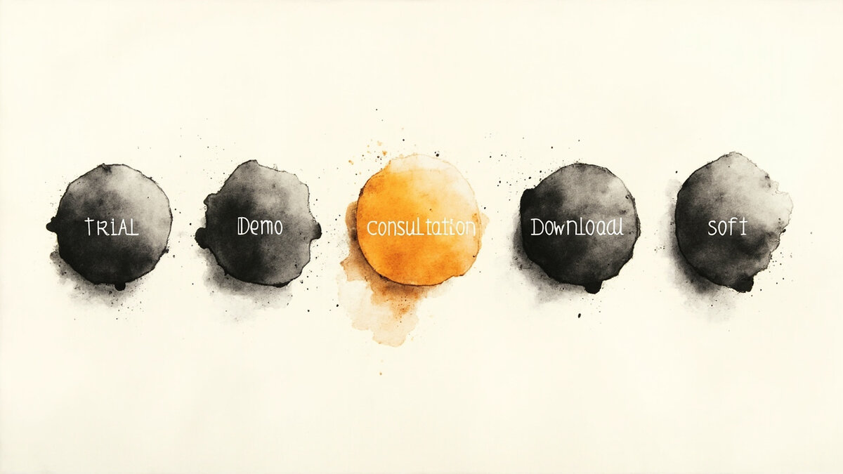
The second pattern is the demo CTA. The copy is “Book a demo” or “See it in action.” The button is the primary CTA color. The CTA is right for B2B SaaS where the sale requires a sales conversation. The CTA assumes the visitor is not ready to start a self-serve relationship.
The third pattern is the consultation CTA. The copy is “Book a consultation” or “Talk to an expert.” The button is the primary CTA color. The CTA is right for services, agencies, or high-touch B2B SaaS where the buyer needs expert advice before the purchase.
The fourth pattern is the download CTA. The copy is “Download the case study” or “Get the full case study.” The button is the primary CTA color. The CTA is right for high-consideration purchases where the visitor wants more proof before the conversion. The CTA assumes the visitor needs the longer story.
The fifth pattern is the soft CTA. The copy is “Read more testimonials” or “See what others are saying.” The button is a secondary color (not the primary CTA color). The CTA is right for the top of the funnel (homepage, blog) where the visitor is not ready to buy. The CTA is the bridge from testimonial reading to deeper research.
The 3 design rules
The first rule is that the button color stands out from the testimonial wall. If the testimonials are on a cream background with dark text, the CTA button is a saturated color (orange, blue, green). If the testimonials are on a dark background, the CTA button is a light color (white, cream). The contrast is the visibility.
The second rule is that the button copy is specific. The copy is “Start your free trial,” not “Click here.” The copy is “Book a demo,” not “Learn more.” The copy is the action. The visitor should know exactly what happens when they click.
The third rule is that the button has visible breathing room. The button has padding (16-24px vertical, 32-48px horizontal). The button has margin (24-48px from the testimonials above and the next section below). The button is not crammed against the content. The breathing room is the prominence.
For the design view of where the CTA fits in the page, see the testimonial page design.
The 4 placement options
The first placement is below the testimonials. The CTA is centered or right-aligned below the last testimonial. The CTA is the natural next step. The placement is the most common. The placement works for every page type.
The second placement is to the right of the testimonials. The CTA is in a sidebar or right column, aligned vertically with the testimonial section. The placement works for desktop layouts. The placement does not work on mobile (the sidebar collapses).
The third placement is sticky. The CTA follows the visitor as they scroll. The CTA is always visible. The placement works for long pages where the visitor scrolls past the testimonial section. The placement does not work for short pages.
The fourth placement is a popup or exit-intent. The CTA appears when the visitor is about to leave the page. The CTA offers the trial or demo one last time. The placement is aggressive but can recover abandoning visitors. The placement is right for high-consideration offers.
The 3 things that make CTAs work
The first thing is specificity. The CTA copy is specific: the action, the outcome, the friction level. The visitor knows what happens when they click. The CTA copy is not generic.
The second thing is contrast. The CTA button color stands out from the testimonial wall. The visitor sees the CTA in 1-2 seconds. The CTA is the most prominent element below the testimonials.
The third thing is momentum. The CTA is placed where the visitor is ready to act. The placement is right after the testimonials (the social proof has done its work). The placement is not interrupting the testimonials. The placement is the natural next step.
The 3 things that make CTAs fail
The first failure is the generic copy. The CTA copy is “Click here” or “Learn more.” The copy tells the visitor nothing about what happens next. The visitor does not click. The CTA is a wasted opportunity.
The second failure is the invisible button. The CTA button color matches the wall background. The visitor cannot see the CTA. The CTA is functionally absent. The conversion is lost.
The third failure is the wrong placement. The CTA is buried in the middle of the testimonials. The CTA interrupts the social proof. The visitor is annoyed. The CTA is counterproductive. The CTA should be the next step, not the obstacle.
For the conversion impact that justifies the CTA, see the social proof for conversion.
The 3 things to test
The first thing to test is the CTA copy. The team runs an A/B test with two versions of the copy. The team measures the click-through rate. The team picks the winner. The test takes 2-4 weeks to reach significance.
The second thing to test is the CTA color. The team runs an A/B test with two colors (e.g., orange vs blue). The team measures the click-through rate. The team picks the winner. The test takes 2-4 weeks.
The third thing to test is the placement. The team runs an A/B test with two placements (below vs sticky). The team measures the click-through rate. The team picks the winner. The test takes 2-4 weeks.
The CTA copy patterns that lift conversion
The text of the CTA matters more than the design. The 4 copy patterns below produce the highest click rates.
Pattern 1: Low-friction language. “Share your story” feels easier than “Write a testimonial.” “Take 2 minutes” feels easier than “Submit your feedback.” Reducing perceived effort lifts click rates 20-40%.
Pattern 2: Recipient-focused language. “Help other [persona]s make better decisions” frames the click as helping peers, not doing work for you. The framing matters for motivated customers.
Pattern 3: Outcome-focused language. “Tell us what changed for you” is clearer than “Leave a review.” Customers know what to expect.
Pattern 4: Personal language. “Got 90 seconds, [first name]?” personalizes the ask. Personalization increases click rates 15-25% on average.
The 4 patterns reduce friction and increase clarity. The exact wording depends on the audience and placement. Test 2-3 variants and measure.
CTAs in the in-product context
In-product CTAs are different from page CTAs. The 4 considerations below explain why.
Consideration 1: Trigger moments. In-product CTAs appear after specific actions (completed task, hit milestone). The timing matters more than the copy. The right moment produces 15-25% click rates.
Consideration 2: Modal vs slide-out. Modals are high-emphasis but disruptive. Slide-outs are low-emphasis but ignored. The right choice depends on the importance of the action.
Consideration 3: Dismissal memory. In-product CTAs must respect dismissal. A customer who dismisses should not see the same CTA again. Track dismissals and exclude them.
Consideration 4: Frequency limits. In-product CTAs should appear once per customer per 30 days minimum. More than that trains the customer to dismiss.
The 4 considerations shape in-product CTAs. The mechanics matter more than the copy at this scale.
How CTAs convert with testimonials (the integration)
CTAs that combine testimonial language with proof elements convert 2-3x higher than standalone CTAs. The 4 integration patterns below describe how.
Pattern 1: Testimonial + CTA above the fold. The testimonial sits to the left of the CTA. The visitor reads the testimonial, trusts the brand, then clicks. The placement is the home page hero.
Pattern 2: Testimonial embedded in the CTA card. The testimonial block includes a sentence and a “share yours” link. The visitor sees real social proof while the CTA option is right there.
Pattern 3: Social proof + CTA in the footer. The footer has 3-5 testimonials on the left and a CTA on the right. The visitor scans both. The CTA gets a 30-50% lift from the testimonials.
Pattern 4: Testimonial-driven CTA in email. The email includes 1 testimonial and a “share your own” CTA below it. The pattern recurs in email campaigns.
The 4 patterns show that CTAs and testimonials are complementary. The testimonial reduces friction by showing the visitor what is expected. The CTA captures the visitor who is willing.
What changes when you ship 5 CTA variants per quarter
The shift is visible in 2 metrics within 90 days of running a CTA A/B testing cadence.
Metric 1: Click rate. A program that tests 5 CTA variants per quarter and rolls out winners produces steady lift in click rates. Year-over-year, click rates on testimonial CTAs lift 20-40% with disciplined testing.
Metric 2: Conversion from CTA click to testimonial submission. The form after the CTA matters. The CTA that promises “2 minutes” needs a form that actually takes 2 minutes. The full funnel improves when both are aligned.
The right CTA program is disciplined and ongoing. Each quarter produces new winners. The library of tested CTAs compounds into long-term conversion improvement.
The journey after this page
If you have the CTA pattern and want the broader display category, the displaying testimonials page is the parent reference. For the wall pattern, the wall of love page is the dedicated reference. For the design view, the testimonial page design page is the dedicated reference. For the conversion view (how testimonial impact is measured), the social proof for conversion page is the dedicated reference.
For the carousel pattern (a specific layout that uses a CTA), the testimonial carousel page is the dedicated reference. For the slider pattern, the testimonial slider page is the dedicated reference. For the pricing-page testimonial pattern (where the CTA is the price), the testimonials on pricing pages page is the dedicated reference.
For the software side (the tool that hosts the wall where the CTA appears), the testimonial software pricing page is the pricing view. For the broader category, the testimonial software page is the parent reference.
The popup is one of several conversion-focused formats. For the popup-specific decision framework, see testimonial popup. Related: CTA placement on landing pages. Related: funnel CTA placement.