
Testimonials on product pages: the 6 patterns, the 3 failure modes, and the 5-item checklist
Testimonials on product pages have 6 patterns: the above-the-fold testimonial, the reviews-tab section, the photo-review gallery, the verified-buyer badge, the star rating near the price, and the video review.
The patterns differ from pricing-page or homepage patterns because the product page has a single conversion goal (buy) and the visitor is in high-intent mode. The right pattern depends on the product, the price, and the visitor’s hesitation. The wrong pattern is the homepage wall pasted onto the product page.
This page is the product page view. The displaying testimonials page is the broader display category. The testimonials on pricing pages page is the pricing-specific view (sibling).
The testimonials on WordPress page is the platform-specific view. The testimonial carousel page is the carousel pattern. This page is the product-page-specific patterns: the 6 patterns, the 3 failure modes, the 5-item checklist, and the 3 things to test.
What product page testimonials are, and what they aren’t
Product page testimonials are the social proof that appears on an ecommerce product detail page (PDP). The page has one conversion goal: the visitor adds the product to the cart. The testimonials exist to reduce purchase hesitation. The visitor is comparing, hesitating, and looking for reasons to commit or leave.
Product page testimonials are not homepage testimonials. The homepage wall is a curated selection. The product page testimonials are specific to this product: the visitor expects to see reviews from other buyers, not general brand testimonials.
Product page testimonials are also not pricing page testimonials. The pricing page compares plans. The product page shows the value of one product. The testimonial angle is different: “this product worked for me” vs “this plan was right for us.”
The 6 product-page-specific testimonial patterns
The first pattern is the above-the-fold testimonial. The testimonial is one short quote (1-2 sentences) placed near the buy button or the price. The visitor sees the proof without scrolling. The pattern is the highest-leverage spot. The pattern works for every product page.
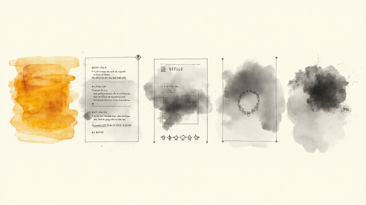
The second pattern is the reviews-tab section. The reviews are in a dedicated tab below the product description. The visitor clicks to expand. The reviews are long-form (50-500 words each), with star ratings and buyer attribution. The pattern works for high-consideration products where the visitor wants depth.
The third pattern is the photo-review gallery. The gallery is a grid of customer photos showing the product in use. The visitor scrolls horizontally or vertically. The pattern works for visual products (apparel, home goods, beauty). The pattern is the highest-impact pattern for visual products.
The fourth pattern is the verified-buyer badge. The badge is a small icon or label next to the reviewer’s name that confirms the reviewer bought the product. The badge is the credibility floor. The badge works for every product page. The badge is the cheapest pattern to implement.
The fifth pattern is the star rating near the price. The rating is the aggregate score (e.g., “4.7 out of 5, based on 234 reviews”). The rating is near the price or the buy button. The rating is the trust anchor. The rating works for every product page.
The sixth pattern is the video review. The video is short (15-60 seconds), the reviewer shows the product, the video is opt-in. The video is best for high-consideration products where the visitor wants to see the product in action. The video is the highest-impact pattern but also the most expensive.
For the pricing-page-specific patterns (a related but distinct page type), see the testimonials on pricing pages.
The 3 product-page-specific failure modes
The first failure mode is the missing aggregate rating. The product page has individual reviews but no star rating summary. The visitor cannot see the overall score. The visitor has to read every review. The fix is to add the aggregate rating near the price.
The second failure mode is the unverified reviews. The product page has reviews but no verified-buyer badge. The visitor cannot tell who actually bought the product. The visitor discounts the reviews. The fix is to add the verified-buyer badge to every review.
The third failure mode is the buried testimonial. The product page has testimonials at the bottom of the page, below the description, below the specs. The visitor has to scroll 4 screen heights to see the proof. The fix is to add an above-the-fold testimonial near the buy button.
For the conversion impact that product page testimonials deliver, see the social proof for conversion.
The 5 product-page optimization checklist items
First: the aggregate rating is near the price. The rating is visible without scrolling. The rating is the trust anchor.
Second: every review has the verified-buyer badge. The badge is on every review, not just some. The badge is the credibility floor.
Third: at least one testimonial is above the fold. The testimonial is a short quote near the buy button. The testimonial is the hesitation reducer.
Fourth: the reviews tab has 5+ reviews. The tab is empty or has only 2 reviews. The visitor assumes the product is unpopular. The fix is to seed with 5-10 reviews before launch.
Fifth: the photo gallery has 3+ customer photos. The gallery is empty or has stock photos. The visitor assumes the product is not in demand. The fix is to seed with 3-5 customer photos before launch.
For the form-based collection that feeds the product page reviews, see the testimonial forms.
The 3 things to test on product pages
The first thing to test is the above-the-fold testimonial placement. The team runs an A/B test with the testimonial near the price vs below the description. The team measures the add-to-cart rate. The team picks the winner. The test takes 2-4 weeks.
The second thing to test is the aggregate rating visibility. The team runs an A/B test with the rating near the price vs in the reviews tab. The team measures the add-to-cart rate. The team picks the winner. The test takes 2-4 weeks.
The third thing to test is the verified-buyer badge prominence. The team runs an A/B test with the badge next to the name vs below the name. The team measures the add-to-cart rate. The team picks the winner. The test takes 2-4 weeks.
The journey after this page
If you have the product page view and want the broader display category, the displaying testimonials page is the parent reference. For the pricing-page-specific view (a related page type), the testimonials on pricing pages page is the sibling reference. For the platform-specific view (WordPress), the testimonials on WordPress page is the dedicated reference.
For the carousel pattern (a layout that works on product pages), the testimonial carousel page is the dedicated reference. For the CTA at the bottom of the product page testimonial section, the testimonial CTA page is the dedicated reference. For the mobile-specific patterns on product pages, the social proof on mobile page is the dedicated reference.
For the trust badges that complement the product page testimonials, the trust badges page is the dedicated reference. For the broader social proof view (how social proof lifts product page conversion), the social proof for conversion page is the dedicated reference.
For the collection side (how to get the verified-buyer reviews in the first place), the testimonial forms page is the form-based collection reference. For the software that supports product page embeds, Testivo is one tool that supports product-page-specific testimonial embeds with verified-buyer support.
The 6 patterns work together. A product page can have an above-the-fold testimonial near the buy button (pattern 1), a star rating near the price (pattern 5), and a reviews tab below the description (patterns 2 + 4).
The combination covers the visitor who skims (rating + above-fold), the visitor who scrolls (reviews tab), and the visitor who wants the credibility floor (verified-buyer).
The photo gallery (pattern 3) and video review (pattern 6) are the highest-impact patterns. The photo gallery works for visual products where the visitor wants to see the product in use. The video review works for high-consideration products where the visitor wants depth. Neither pattern is universal. The right pattern depends on the product category, the price point, and the visitor’s research style.
The aggregate rating near the price is the trust floor. The visitor who skims the product page sees the rating within 3 seconds. The rating is the anchor for every other pattern. Without the rating, the visitor has to read individual reviews to assess quality. With the rating, the visitor has a quick proxy.
The verified-buyer badge is the credibility floor. Every review should have it. Without it, the visitor assumes the reviews are fabricated. With it, the visitor trusts the reviews enough to commit. The badge is cheap to implement and high-leverage. The badge is the floor.
The reviews-tab section is the depth zone. The visitor who scrolls past the description wants long-form, specific reviews. The reviews include the use case, the before, the after, the specific outcome. The visitor reads 3-5 reviews and decides. The reviews-tab is the most-researched page on the product page. The visitor uses it to validate the purchase.
The reviews are sorted by recency and by helpfulness. The most recent reviews appear first. The most-helpful reviews (marked by other visitors) appear first. The sorting is the signal. The visitor trusts the top reviews more than the bottom reviews.